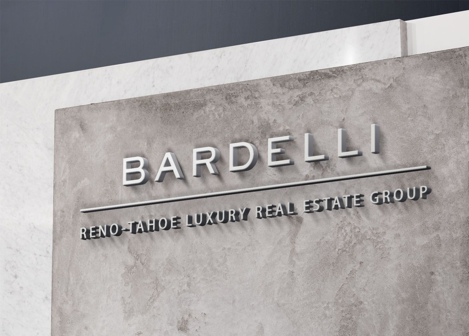
Bardelli Reno-Tahoe Luxury Real Estate Group Logo
In designing the logo for Bardelli Reno-Tahoe Luxury Real Estate Group, the aim was to encapsulate the essence of timeless sophistication. With a color palette of mellow, slate blue/grey, the logo echoes the tranquility of Lake Tahoe and evokes a sense of elegance. The minimalist approach to design reflects modernity, while the incorporation of luxurious fonts speaks to the professionalism and exclusivity of the real estate group. The logo exudes simplicity, sophistication, and luxury, embodying the refined aesthetic and service that Bardelli Reno-Tahoe Luxury Real Estate Group offers to its clientele in the Reno and Lake Tahoe areas.
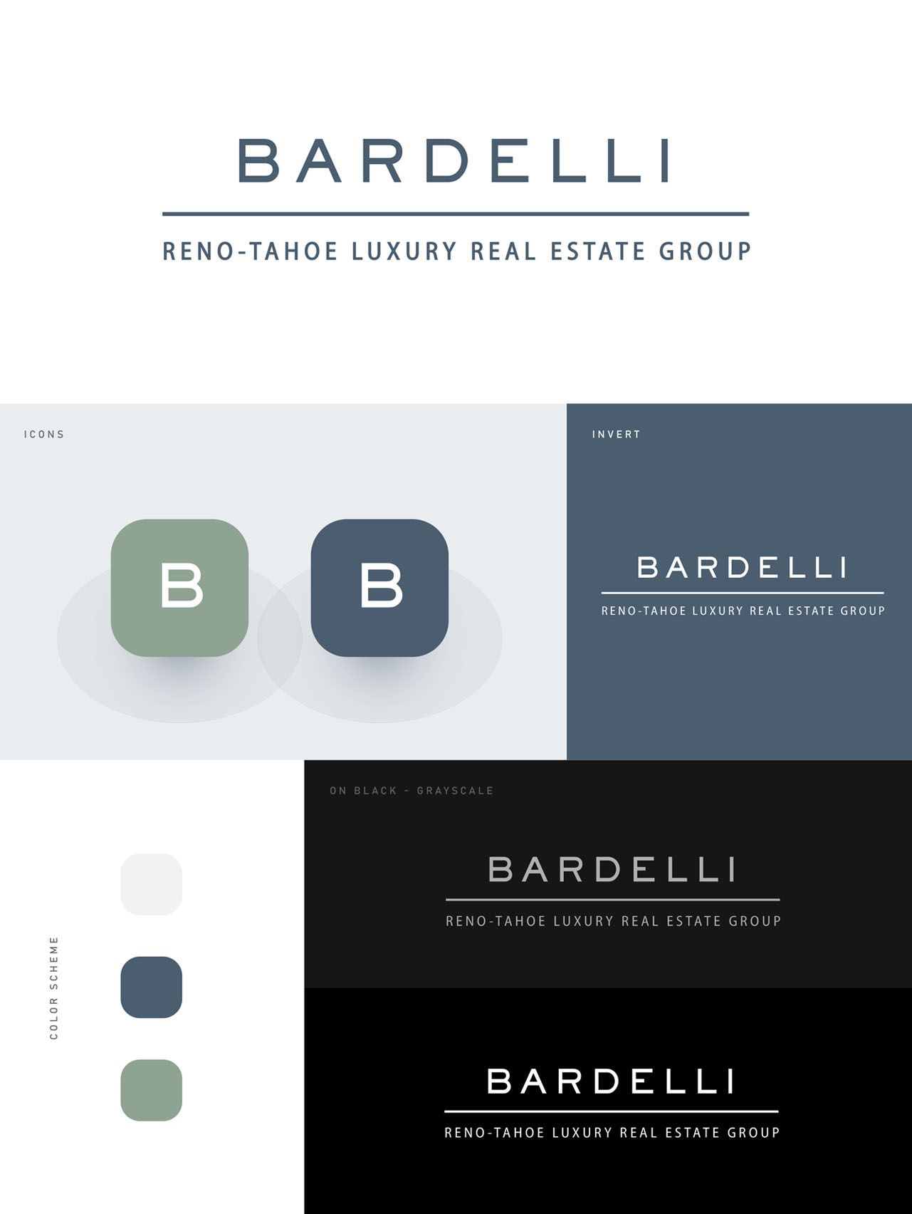